Re: Logo Critique Posted by Na on Feb 18, 2014
Hmm, it seems I found another email address for her. It's Beavegadesign AT gmail DOT com. The link to her website must be in my emails that I can no longer access.
Re: Logo Critique Posted by TygerMin on Feb 18, 2014
Thank you, I will shoot her an email 
Re: Logo Critique Posted by Na on Feb 18, 2014
No probs. Good luck with it!
Re: Logo Critique Posted by TygerMin on Feb 25, 2014
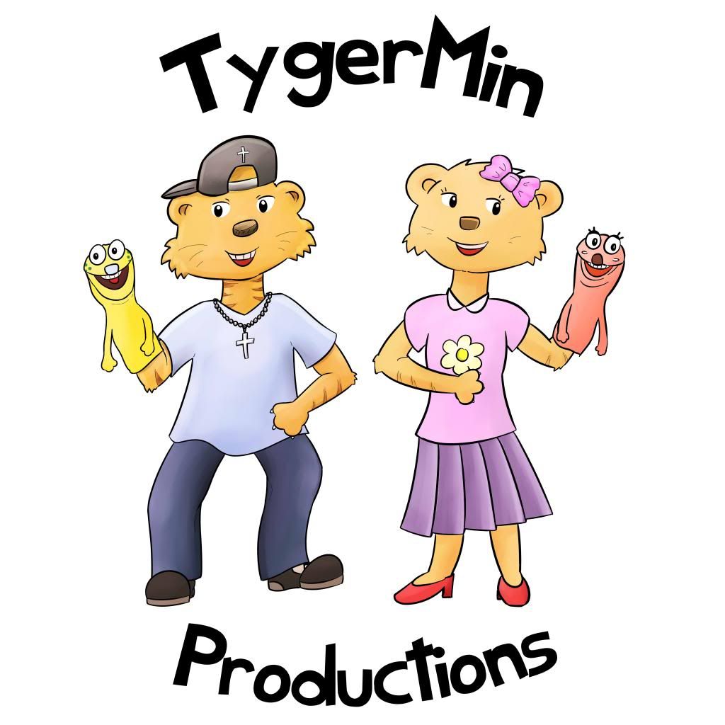
So...yeah. This is what Fiverr ended up with:

Not bad for the price I paid, but will definitly be keeping my eyes open for other opportunities.

Not bad for the price I paid, but will definitly be keeping my eyes open for other opportunities.
Re: Logo Critique Posted by Shawn on Feb 25, 2014
I like it.
Re: Logo Critique Posted by TygerMin on Feb 25, 2014
Love the characters, just wasn't sure on it as a logo. Asking to see it with TygerMin arched above and Productions arched below.
Re: Logo Critique Posted by Na on Feb 26, 2014
I like it too! It's excellent graphics for the price you've paid. 
Re: Logo Critique Posted by TygerMin on Feb 26, 2014
Re: Logo Critique Posted by Na on Feb 27, 2014
It does look good - but I still worry about the complexity of it. As it happened, I was out shopping and got some lunch and while I did I checked out P&S on my iphone. At that size, you do indeed lose lots of the detail - heck you lose a lot of it now just with the thumbnail (on a laptop).
It's great work though
It's great work though
Re: Logo Critique Posted by TygerMin on Mar 12, 2014
Thanks everyone for the recommendation of Beatriz Vega. She does great work, and I am having trouble picking a design 


Loading
No More Post
Error
- ← Previous
- 1
- 2 (current)
- 3
- 4
- Next →
Loading