Re: Logo Critique Posted by Na on Mar 12, 2014
#6 is my favourite 
Re: Logo Critique Posted by Shawn on Mar 13, 2014
Those are great! Really love Beatriz's work. I think maybe my vote is also for #6. I like the idea of a fast forward button. I do like the tightness of the stacked letters. Might be you would need those for say FB or other social media applications. Don't forget they tend to use a square format for display of your profile pic/avatar.
Re: Logo Critique Posted by Out of the Box Puppets on Mar 13, 2014
I like 6 & 7, but how about adding the lettering from #1 under the logo instead of out to the side.
My question is what is TygerMin productions and does the logo express it?
Julie
My question is what is TygerMin productions and does the logo express it?
Julie
Re: Logo Critique Posted by TygerMin on Mar 13, 2014
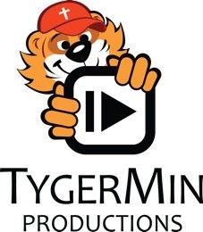
Final logo is 6 with typography of 8. Can't seem to upload from phone.
Dies the logo express the company? Honestly, not yet. TygerMin Productions will be a puppet custom video company that adds depth to their core characters through an original web series. The goal is to break into marketing and advertising while maintaining a family friendly source for unique announcements. The tiger will be the central character and company mascot which is a representation of myself.
IOW, I have a soft spot for that character and can't seem to let him go. Created him 12 years ago for an event centered ministry that never materialized. Tyger Ministries...
Re: Logo Critique Posted by Na on Mar 14, 2014
Posted by: TygerHawks on Mar 13, 2014
Dies the logo express the company? Honestly, not yet. TygerMin Productions will be a puppet custom video company that adds depth to their core characters through an original web series. The goal is to break into marketing and advertising while maintaining a family friendly source for unique announcements. The tiger will be the central character and company mascot which is a representation of myself. .
I know what you're talking about and still i have no idea what that means. Remember what we talked about - clarity in language. Ie. what does 'unique announcements' mean?
Re: Logo Critique Posted by Shawn on Mar 14, 2014
I wonder if "personalized announcements" would be better.
Re: Logo Critique Posted by TygerMin on Mar 14, 2014
What Shawn said, kind of what I meant. That is why I am not a public speaker :D
Re: Logo Critique Posted by TygerMin on Mar 14, 2014
Finally at a computer. Thanks everyone for the advice  Final design:

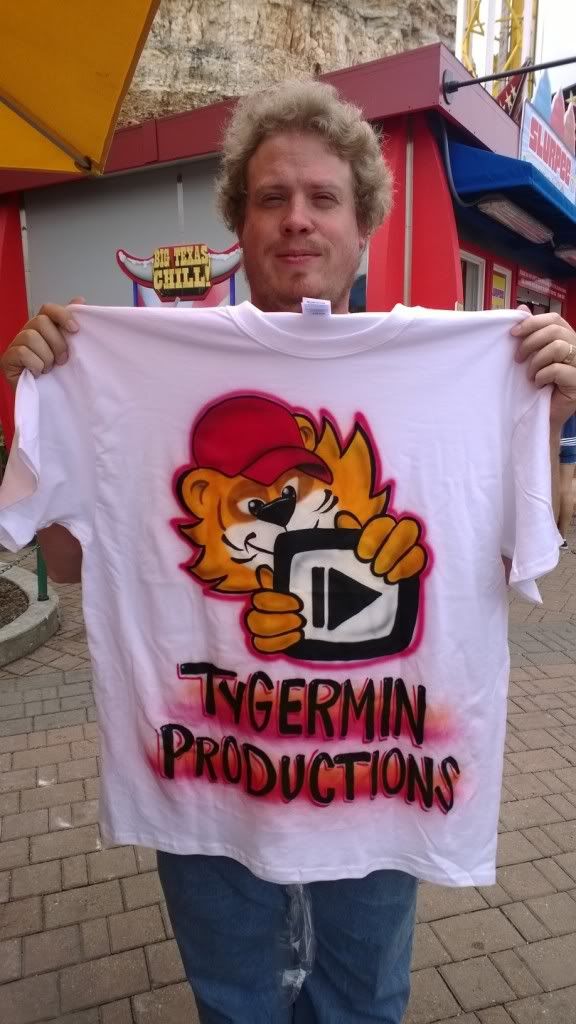
Spent a bit of money at Six Flags though:


Spent a bit of money at Six Flags though:

Re: Logo Critique Posted by Na on Mar 14, 2014
Posted by: Shawn Sorrell on Mar 14, 2014
I wonder if "personalized announcements" would be better.
I wonder if people would take 'announcements' to mean something you do over the radio... maybe that's just my reaction to it though.
Finally at a computer. Thanks everyone for the adviceFinal design:
Looks fab!
Re: Logo Critique Posted by titere on Mar 20, 2014
Oh, I like that logo!!! :D
Loading
No More Post
Error
- ← Previous
- 1
- 2
- 3 (current)
- 4
- Next →
Loading